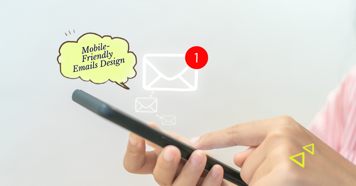
Mobile-friendly email design ensures your messages are easy to read on phones and tablets where most people check their inbox. When your emails adapt to small screens, you respect your reader’s time and make it easier for them to take action.
Building for mobile first improves your click rates and keeps your audience engaged while they are on the go. If your layout breaks or your text is too small, people will simply delete your message or unsubscribe out of frustration. Good design creates a smooth path for your customers, while a broken layout creates a barrier between you and your goals.
In this guide, you will learn how to simplify your layouts and adjust your content for smaller screens. We will look at practical ways to make your links easy to tap and your text easy to read without requiring a massive design budget.
Designing for the phone is really just about making things easier for the person on the other side of the screen.
Key Takeaways
- Readability is a form of respect. When you use large fonts and clear spacing, you show your audience that you value their comfort and their eyesight.
- Thumb-friendly design reduces friction. Making buttons easy to tap helps busy people interact with your business without having to zoom in or struggle.
- Simplicity builds trust. A clean, single-column layout feels professional and reliable, whereas a cluttered design feels like digital noise.
- Testing prevents silent failures. Seeing how your email looks on your own phone helps you catch small mistakes before they reach your entire list.
Once you understand these basics, you can stop worrying about how your emails look and start focusing on what you want to say. Let’s look at how these small changes make a big impact on your business results.
Mobile design is about screen space
Mobile-friendly design is the practice of creating emails that look good and function well on any device, regardless of screen size. In the past, emails were designed like websites with multiple columns and small text, but today, we focus on a single-column flow. This approach ensures that your content stacks vertically, making it natural for a user to scroll through your message with one hand.
This matters because more than half of all emails are now opened on mobile devices during commutes, coffee breaks, or between meetings. If your email requires a user to pinch and zoom just to read a sentence, they will likely close it within seconds. By prioritizing a mobile-responsive layout, you ensure that your message is actually seen and understood by the widest possible audience.
In a typical workday, a consultant might send a newsletter with three different service offers. On a desktop, these might sit side-by-side, but on a phone, they should stack one on top of the other. This prevents the images from becoming tiny thumbnails and keeps the text at a size that is comfortable to read while walking or standing in line.
A solo founder recently noticed their click rates were dropping despite having great content. After sending a test to their own phone, they realized the “Buy Now” button was so small it was almost impossible to tap. They increased the button size and simplified the header, and their engagement rates bounced back immediately.
Keep your layout to one column
A single-column layout is a design structure where all your content follows one vertical path from top to bottom. Instead of having a sidebar or multiple boxes of information next to each other, you place your images, text, and buttons in a straight line. This is the foundation of mobile-friendly email because it removes the need for horizontal scrolling, which is difficult on a narrow screen.
Using one column significantly improves your content hierarchy and makes it much easier for the reader to follow your story. When information is stacked, you control the order in which the reader sees your ideas, leading them naturally toward your call to action. This clarity reduces the mental effort required to process your email, which leads to better retention and higher conversion rates for your business.
Think about a local non-profit sending out an event invitation with a photo, a description, and a RSVP button. In a mobile-friendly version, the photo sits at the top, the text follows below it, and the button sits clearly at the end. This layout feels intentional and organized, making it very easy for a donor to understand the event and sign up quickly using their thumb.
Use larger fonts for easy reading
Font size refers to the height of the characters in your email, and for mobile users, bigger is almost always better. We recommend using at least 16px for body text and even larger for your headings to ensure everything is legible at arm’s length. High contrast, such as dark text on a light background, also plays a major role in how easily a person can scan your message in different lighting conditions.
When text is too small, readers have to strain their eyes, which creates a negative experience associated with your brand. Good typography makes your email feel accessible to everyone, including people with visual impairments or those viewing their phones in bright sunlight. By making your text easy to consume, you lower the barrier for your audience to engage with your expertise or your products.
Imagine a freelancer sending a project update to a busy client who is checking their phone while traveling. If the update is written in 12px font, the client might skim over important details or miss a question entirely. By using 18px font and plenty of line spacing, the freelancer ensures the client can read the update effortlessly, leading to faster approvals and better communication.
Make your buttons easy to tap
Touch targets are the clickable areas in your email, such as buttons and links, that a user interacts with using their finger. On a mobile device, these targets need to be large enough to be hit accurately without accidentally clicking something else nearby. A good rule of thumb is to make buttons at least 44 pixels tall and wide, providing enough “breathing room” around them so they stand out.
If your links are buried in a paragraph or your buttons are too small, you are essentially hiding the “exit” or “action” from your customer. Large, clear buttons act as visual cues that tell the reader exactly what to do next, which directly impacts your revenue and click-through metrics. When a user can easily interact with your email, they feel more confident in your professionality and are more likely to return.
A small e-commerce brand might send a discount code to their subscribers with a “Shop the Sale” button. If that button is a tiny text link, many users will miss it or get frustrated trying to click it. By turning that link into a bold, colorful button that spans the width of the screen, the brand makes it incredibly easy for a customer to start shopping with a single tap.
Industry data shows that the average human thumb is about 45 to 57 pixels wide. Designing buttons that match this size isn’t just a style choice; it is a fundamental requirement for basic usability in a mobile-first world.
Conclusion
Focusing on mobile-friendly email design is one of the most effective ways to improve how you communicate with your audience. By sticking to a single-column layout, using readable font sizes, and creating large tap targets, you make your emails accessible to everyone. These changes don’t require complex coding skills, but they do require a shift in how you think about the person opening your message. When your emails are easy to navigate, your readers are more likely to stay subscribed and engage with your work over the long term.
As you move forward, try sending your next few email drafts to your own phone first to see how they feel in your hand. Look for any areas where the text feels cramped or the links are too close together and adjust them before hitting send. You do not need a perfect design to be effective, but being thoughtful about the mobile experience will help you build a stronger connection with your list. Remember that every small improvement you make helps your business grow by making life just a little bit easier for your customers.
FAQ
What is the best font size for mobile emails?
You should aim for at least 16px for your body text and 22px or larger for your headings. This ensures your message stays readable on small screens without forcing the user to zoom in.
How do I check if my email is mobile-friendly?
The easiest way is to send a test email to your own mobile device and open it in a few different apps like Gmail or Mail. Most email marketing platforms also offer a mobile preview mode within their editor to help you spot issues early.
Should I use many images in my mobile emails?
It is best to use images sparingly and ensure they are not too wide, as large files can slow down loading times on mobile data. Always include alt-text for your images so that if they don’t load, your reader still understands the context of your message.